I'm entering the contest at Our Creative Corner (OCC) this week. I'm basing my design on Amy Sheffer's design, but I turned it to accomodate the chipboard "Good Times" that I found at the "Dollar Tree" with some papers. I was in a hurry and didn't want to check through different colored papers to find matches, so I grabbed this cheap kit and put this together rather quickly. I put the butterfly up in the corner as I thought it needed something there. I also antiqued it with Ranger Distressed Linen and a darker color. I like the way it turned out.
No stamps used. It's a square 4" X 4" card and
Saturday, September 27, 2008

Friday, September 26, 2008
Post-it note gift
Hero Arts contest and I wanted to make a gift, but what, something that's not going to be costly and yet has the potential for being a decent gift or something I could use if it wasn't gift-worthy, so to speak. Where else? Yes, the Dollar Tree.
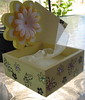
Round and round I went.... ok, a journal... something that's not got a lot on it so I can hopefully do SOMETHING with it. And, mmm, ok, a little box with flower (before picture) that looks like post-it notes can fit inside... well, I guess I wouldn't exactly whoop it up over a gift of post-it notes... but oh well, I'm tired, I've passed this aisle how many times? ok, not 100s, but... enough is enough. TWO things.... I'm taking them home.
I either already posted the journal or will post it after this. On with the little box. I've included another link for a picture of the other side. I'm going to recap what's on the description of the project --- I painted the box in two light colored yellows so it looks a little antiqued - hard to see here. I painted the pink flower yellow and the circle white. I found flowers in just the right yellow and added white on top with a yellow brad. Had to pop dot around the wood circle as the insert is too far back. I stamped flowers and butterflies on the outside of the box and put gems in some of the flowers and each butterfly on the box has 4 small gems - each butterfly has a different color. I stamped the post-it notes (yes, each page) at the bottom with the two flowers from the box. Because this is a close fit for the post-it notes, I put sheer yellow ribbon, knotted it on both ends and will tie it once I put that last post-it note pack in. Once they start using the notes, it they want to take an entire pad out, they can use the ribbon to lift up the pads. My daughter-in-law fell in love with this. It has a fresh, clean feel to it. (I like it too, hate parting with the little thing - it's already destined to go in a basket for one of my best friends).
Hope you liked the make-over - oooh, do they have those make-over shows on TV still? Sorry - just haven't watched TV litterly in years - well to watch a TV channel... got a DVD. I was so happy this morning when I put the finishing touches on this. I really love the way it turned out.
Featuring a great card and blog today
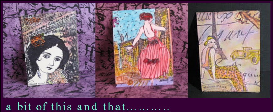
Fetish for Paper - a great blog and a wonderful card today on Hero Arts blog and some great video links also. What wonderful ideas for new and fun ways to do a card. I'm sure people wonder how a card, an ordinary card can hold so much attraction for the scrapper or card maker. That's because artists take the next step and create a new a unique item, a creation with their unique signature.
Creativity spawns creativity. Having people of like minds gather in a community of sharing seems to multiply the awareness of the things around us that impact our lives. Either attending a convention, taking a class at your local craft store, or going on-line to peek at what everyone else has been up to. More and more, people are accessing the internet to expand their knowledge with new techniques and to remember those old ones that never fade away.
Creativity spawns creativity. Having people of like minds gather in a community of sharing seems to multiply the awareness of the things around us that impact our lives. Either attending a convention, taking a class at your local craft store, or going on-line to peek at what everyone else has been up to. More and more, people are accessing the internet to expand their knowledge with new techniques and to remember those old ones that never fade away.
Wednesday, September 24, 2008
Splitcoast Technique
I made my way from Beverly's Little Shop of Crafts to Splitcoast Stampers to see how to make the lovely and unique card that made for the holiday Hero Arts contest for the week of September 18th. What a fun idea. I love learning new things. You could get all your materials ready before and make a bunch for your close friends or neighbers. It has its own envelope and would be a wonderful hand-carried card or for a longer message than what you'd write on a small gift card.
Difference between dye and pigment based inks
I always wondered what the difference was between dye-based and pigment inks. I found the article below at http://www.printerfillingstation.com/PFS/Pigmented.htm
Here is the difference between Standard dye-based ink and Pigmented ink.
Water Resistance
The dye in the dye-based ink dissolves in water like sugar does in water -- completely.
Pigment does not dissolve completely. It is more like a flour and water mixture.
Because of this, dye-based inks flow better and have been the standard in inkjet printers. But the dye will re-dissolve and the ink will flow across the paper if drops of water hit the paper.
Pigmented ink particles tend to settle into the tiny fibers that make up the paper. As the ink dries, the pigment particles get stuck in the fibers. Thus, the pigmented inks are more water resistant than the dye-based inks. Only about 5 to 10 percent of the ink will re-flow if the paper is hit by water.
Fade Resistance
The molecules in dye-based inks are spread out. You might think of dye-based ink on paper as similar to a beach covered with sand. Because of this, dye-based ink tends to fade quicker, since all of the molecules are exposed to the chemical and sunlight-caused reactions that fade the ink. You may notice fading of dye-based inks exposed to direct sunlight commonly in 6 to 12 months.
Pigment particles are similar to large pebbles on a beach. It is much more difficult for sunlight and chemicals to react with all of the pigment molecules, since most of them are hidden inside the "pebbles". Pigmented inks will usually last for many years before fading becomes noticeable.
Print Quality
It is possible to get more "color" into pigments than into dyes. Therefore, pigmented colors tend to be more vibrant than dye-based colors. And pigmented black inks tend to be slightly darker than dye-based inks.
Friday, September 19, 2008
Another great stamp store in Sacramento
For a long time, I've been trying to find The Stamp Art Shoppe's web site to check for events and classes as I love to browse, buy, and learn new techniques at her shop. I always got a message that I hadn't updated a program. I was confused, because that should not be an issue. Finally, I was checking Tim Holtz's site and his calendar link took me right to The Stamp Art Shoppe. The search engine I had first used did not have the correct address.
Now I can check for upcoming events online YAY! This lovely enlarged shop invites you in to enjoy the art of stamping, not just a crafty thing to do. They are in the same shopping center, but in the corner. Great place to wonder around, get ideas and learn a bit more than when you came in.
Sandy, the proprietor, is a creative person who has a style that is sophisticated and simple. I like the sharpness of detail that goes into each of her creations.
I entered the penguin contest Sandy put on at her shop. I fell in love with the entry of a peguin on the beach under the umbrella - so did not win, but I was happy with both my submissions. They will be great little gifts for those who delight in the unusual. Loved doing them. That little "Memory Box" penguin was sooooo cute.
December Journal 2008
I made my December journal with the penguin tags. YAY.... SInce three tabs would have been better on this size, I just added a smaller stamped tab.
I do like the shabby chic style that the Hero Arts (HA) challenge of the week is having. I may be able to do a couple more cards.
Just hop on the HA site to view all the great submissions. I also post at a fairly new site. We've got a challenge for the month of September to recycle and see what percentage of the card can be made of recycled materials.... I had never really thought I needed a Cuttlebug, but now that I have one, I LOVE IT.
Wednesday, September 17, 2008
Shabby Valentine
My Shabby Valentine. I'm hearing a crooning voice singing the music to "My Happy Valentine", only instead of "Happy", they insert "Shabby". Oh well... smile.
I never thought I'd ever use that little Heart that I embossed. I couldn't think of anything I'd want to use it for or with. What do you know........ I found a spot for it. I'm happy with this card. Love the colors and all.
Shabby Chic is in. So shabby up your chic and get it on a card! I love all the submissions as everyone gets past their first uneasiness and bafflement on exactly what Shabby Chic meant... See the Flickr group for Hero Arts to see what it's all about. The contest began Monday, so get moving to the Hero Arts site.
Monday, September 15, 2008
Hero Arts Contest week beginning 9/15/08
I was thrilled with last week's subject, because I'm using that little journal right away. It's a working piece of art right now - keeping track of the stamps sets I have that I can't read when I use them... yay!
I am excited over this week's theme. Straight from Hero Arts, (HA), Shari is hosting the HA week on the HA blog. As she says:
A week of blogging just wouldn’t be right without a challenge right? So to start things off, I’d like you to create a Holiday card, project or scrapbook page that uses an element of Shabby Chic design. Just load them into Hero Arts Flickr group with the tag “shabby” Be sure to use at least one Hero Arts stamp on your card and post them by September 21st at 11:59pmPST. From the entries we will pick winners for these prize.
I think the Shabby Chic theme is starting to stir the creative minds of my fellow HA bloggers too. Shari will be sharing lots of Holiday cards with us this week and I'm looking forward to them, one and all. :)
I can envision my December journal right now. Can't you just see that Penguin in the circle in the Warm Wishes CL243 set as Tabs for the journal? And if you want to borrow that idea, go for it. I hope to have enough time to stamp a little something on each page as I was able to do on my September journal, as well as sponge all the pages some color other than white... which looks wonderful, but I'm in a COLOR mood this month.
Have a wonderful week. Arlene
Tomatoes red and green
I just had to take a picture of my beautiful tomato vine - it's growing up the chain link fence and as you can see, the colors are wonderful. They taste so sweet, you can just pop them into your mouth and be surprised every time with the flavor.
I've taken some to work and they are devoured. I leave them on a small table and see people popping them into their mouths as they walk by.
The red is such a vivid color that it makes me think of those fabulous Pacific coast sunsets. Mingled with the green, I'm thinking cards here; perhaps a background of olive green and oranges or yellows or reds to pop out at you.
Friday, September 5, 2008
A fabulous new card style
Please visit http://littleshopofcrafts.blogspot.com/ to see the twist on a pocket card - show off your beautiful patterned paper. This is a great way to use those scraps that we all collect. Love the card she did for the Hero Arts flickr group.
Subscribe to:
Posts (Atom)